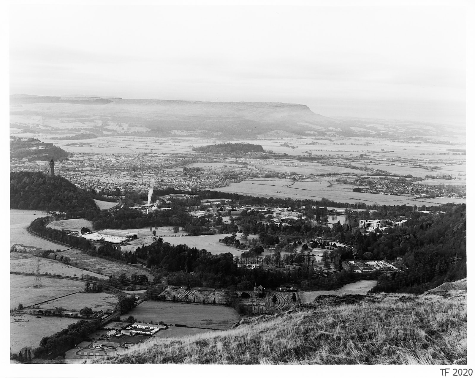
The Cheery World of B&W

My current interest in black and white photography goes back to a three night wild camping trip in my favourite part of the world a couple of years ago. I had planned it for some time, with one particular image in mind, but alas, happened to run into an early heatwave, with all that it brings – largely cloudless skies, haze that even a polarizer can’t do much about, thunder, and rapidly forming, all encompassing, evening inversions.
The weather was so unconducive to photography that on day 2 I simply left the camera in the bag just after breakfast. This, as often, turned out to be a mistake, as I nearly missed the one worthwhile image that came from this trip.
Now the colour original of this picture is rather uninspiring, and my first response seeing it on the big screen was a disappointed ‘doh’. But a B&W conversion opened up different possibilities, and ultimately made me wonder what it would be like to do this properly, i.e., work with B&W as a landscape medium in its own right, rather than using it as a last ditch effort to save a disappointing picture.
So what have I learnt since? Two things: (a) B&W landscape photography is very hard, and (b) taking a half decent B&W picture generally requires thinking in B&W terms before taking it.
Key Issues in B&W Landscape
When the colour dimension is eliminated, the building blocks that I am left with for my image are luminance, texture, and structure. Should be plenty, right? Well, it’s not that simple.
I came to realise rather quickly that the two dominant colour tones that make up the bulk of Scottish landscape for much of the year – the yellow-greens and orange-browns – happen to have quite similar luminance levels, i.e., they translate into rather similar shades of grey.
More so, colours of similar luminance cannot be separated very effectively by the use of traditional B&W filters if they are close to each other on the colour wheel (filters work best for colours across the wheel, e.g., yellow filter for blue and yellow; digital, with its ability to manipulate isolated narrow colour bands, has a definite advantage here, but that comes with its own pitfalls, on that shortly).
And so the quality of the grey scale in a B&W image comes mostly from the quality of the external light, and while good light is key to all photography, it’s doubly so for B&W; I will go as far as saying that I learnt that without interesting light there can be no interesting B&W landscape.
The other thing I have discovered is that the various textures naturally found in landscape, particularly those associated with vegetation, are in fact also quite homogeneous – it would seem that what I often perceive as a different texture at first glance is really a difference in colour. This leaves structure (the larger patterns) in the landscape as just about the only WYSIWYG attribute of the landscape as I initially perceive it.
Visualisation, Visualisation, … Visualisation
The necessary fallout from the above observations is that it is virtually impossible to take a good B&W landscape without giving some advance thought to what the result will look like in grey scale.
Like the image that started my current quest, most of the B&W images I tend to come across these days are, quite obviously, a final attempt to salvage something from a picture that has not come out too well in colour. The aforementioned ability of digital post processing to manipulate narrow bands of colour in the B&W mix often makes things worse, because it allows me to break the natural tonality of the image; sometime this works, but more often it doesn’t.
I have been reflecting on why that is, and come to the conclusion that when we are looking at a monochrome image, our brain is processing it in a similar way in which it processes natural low light scenes, and it baulks when it comes across something it doesn’t expect. For example, my brain seems quite unperturbed by solid black sky, but a steep contrast curve in the clouds (the sort of ‘dramatic’ sky you get with a bit of Lightroom ‘clarity’ thrown in) jars to no end.
Digital does make it possible to experiment with what might and might not work, but personally I prefer working with B&W film as it forces me to focus on the fundamentals and on the landscape itself. (And yes, I do prefer the film look.)
It’s been said that practice makes perfect, and learning to see in B&W certainly comes one image at a time. To me that’s part of the fun, and one of the things that draws me to it.